
This is the first blog post from infogr.am team, one of the Uutisraivaaja finalists. We’ll be sharing our experience and challenges of building data visualization tools for online journalism. In this first blog post we focus on what good things infographics and visualized data does for online media and a brief history on infogr.am.
Infographics are one of most viral and admired things in the internet. They are now even more viral than funny cats, see:
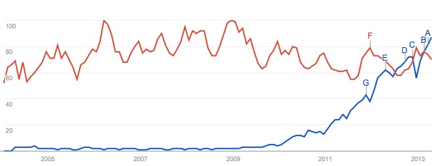 The blue line is Google search volume for a term “infographic”. The red line goes for “funny cats”.
Infographics are also admired by online media as a super-easy way of telling a story. Visualized data are understood dozens of times faster, thus if a visitor just having a glimpse at an article would stay to read it. Infographics increases time spent on site and number of social shares, according to some of our users – up to 60%. That’s a lot for online media that rely of advertisement revenue.
So it’s a good thing, right. The only problem is that it’s pretty complex to make an infographic. It takes about 8 hours for a skilled designer. And it’s not cheap. We did a brief survey in Helsinki: the cheapest offer was 500 euros and it can go up to several thousands.
Clearly news portals and blogs could benefit from having infographics in as many articles as possible. Well, at least a few a day? But the cost and more importantly the time it takes to produce one have been obstacles.
Because when it comes to the news, seconds matter. Even if a news company can afford to spend a few thousands on one infographic, they won’t use them for breaking news. By the time the infographic is finished it’s yesterday’s news.
So, wouldn’t it be great if you could make infographics by yourself, without needing to pay a designer? Or, perhaps, without needing to pay anyone at all? This was the thought we had when me, Uldis Leiterts, and Raimonds Kaze co-founded infogr.am a year ago. Before that we were working in a large news company where we were responsible for data visualization, among other things.
We realized then that we can take apart infographics; brake them into the simplest basic elements. And make a constructor that is easy and simple so anyone could understand how to use it and also so well designed that the user just can’t make ugly infographics with it.
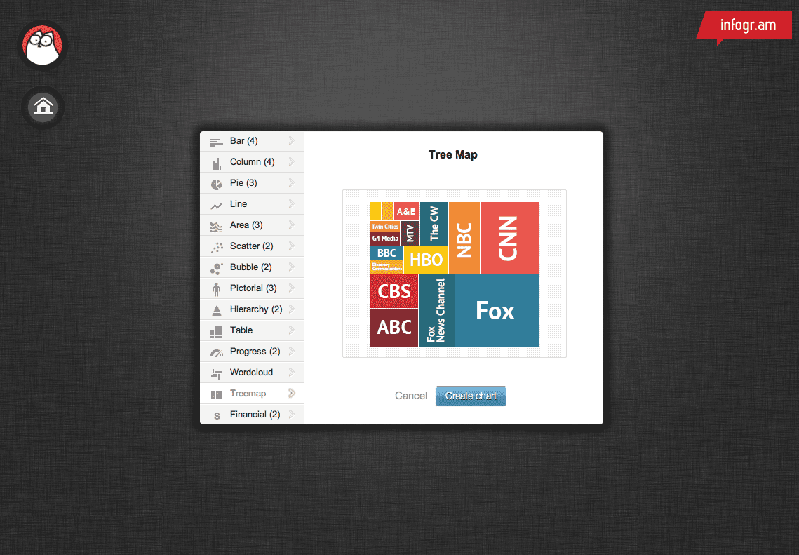
Here’s the tool:
You start with selecting data format. We intentionally wanted to put visual part of information before you even got to enter the data. Our idea is that authors should think first on what would the end result be.
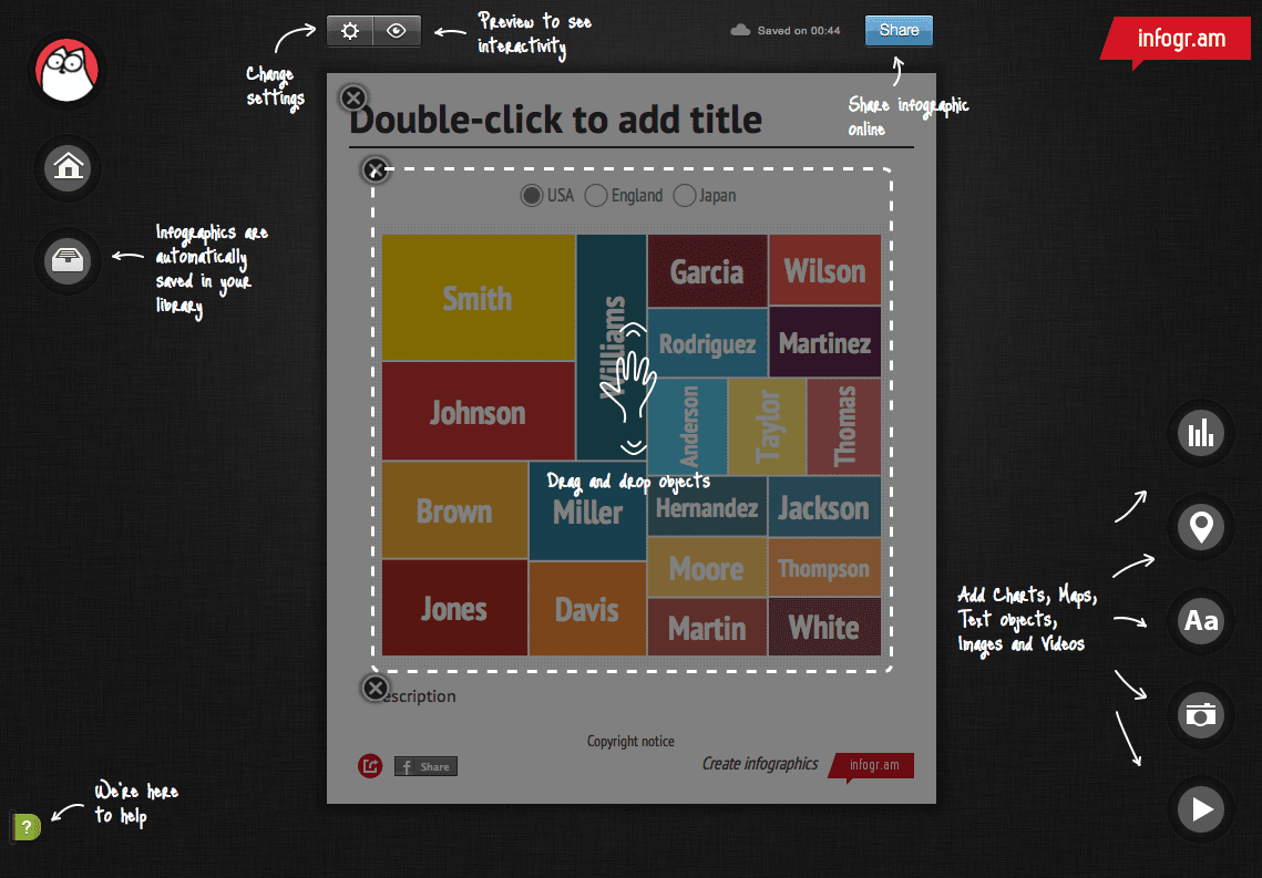
Infogr.am has a very simple drag-and-drop interface. You can add objects like charts, maps and photos with just a click.
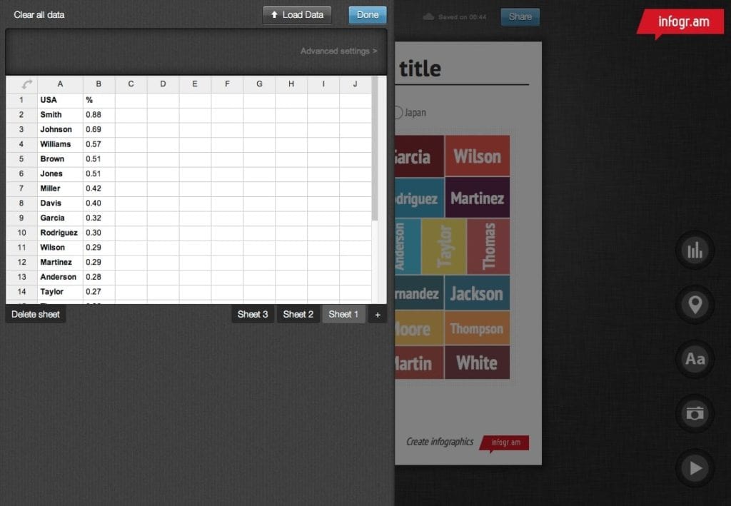
Double click on object opens it in edit mode. There’s a built in spreadsheet for easy data editing, you can also import .xls, .xlsx and .csv files.
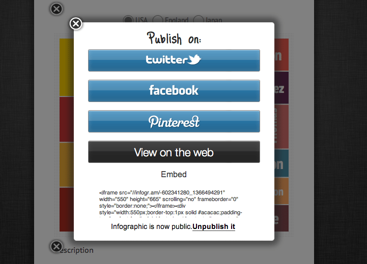
The result can be published online, shared on social media or embedded in any article.
Infogr.am was originally designed for journalists and bloggers to easily create data visualizations for articles. It’s now been used in several other industries, including finance, analytics, education and marketing. The company we started last year at Startup Sauna garage in Otaniemi is now the world’s most popular infographic creator and there are more than 600 thousand infographics made by our users.
Author: Uldis Leiterts, founder, Infogr.am